Radio-Canada Info
Creation of a unified design system for Radio-Canada Info to harmonize the visual and functional experience of digital platforms, while ensuring consistency, accessibility, and development efficiency.
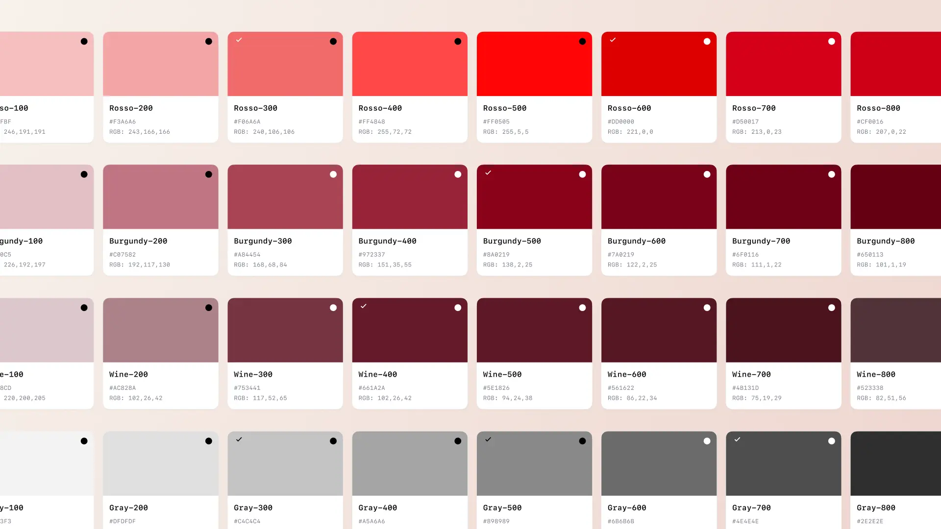
Colors
This mandate required taking into account several sub-brands while ensuring compliance with Radio-Canada's accessibility standards. Special attention was given to color contrasts to meet accessibility requirements, both in light and dark modes, across all display contexts. A centralized color library was created to support internal design teams as well as partners involved in the project.
Iconography
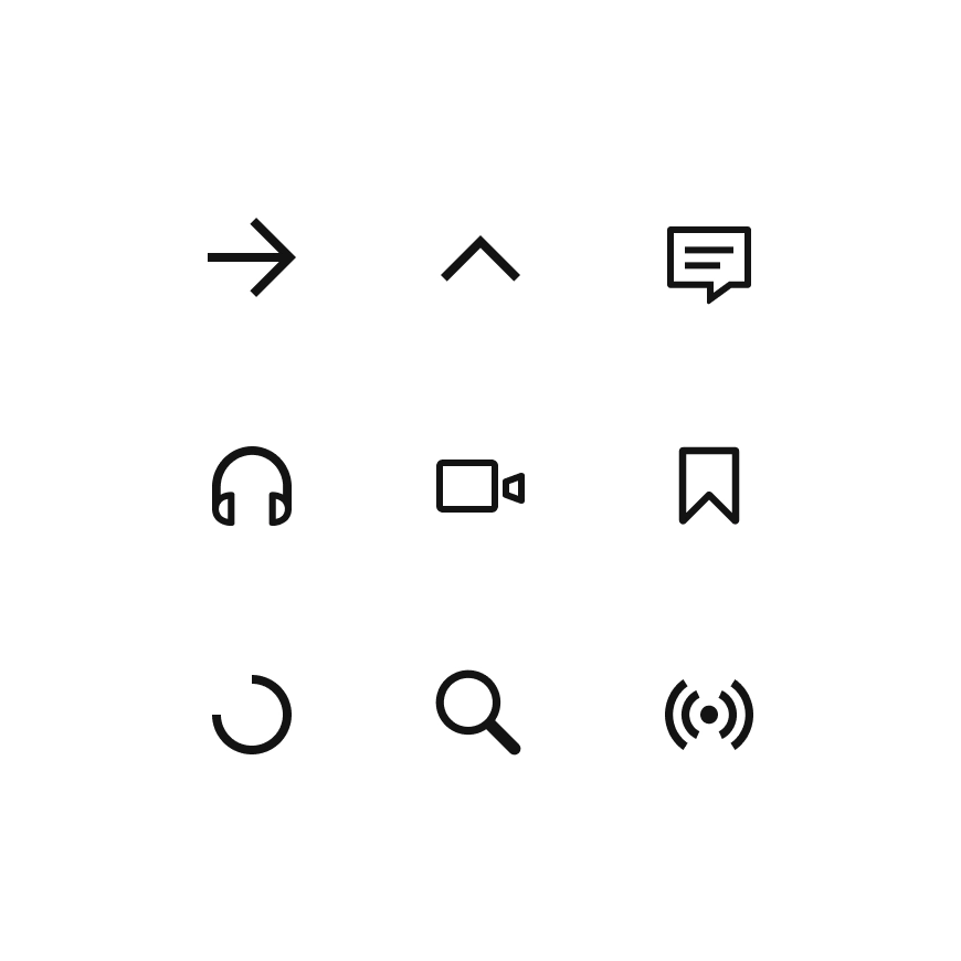
Several custom icons were designed to reflect the new artistic direction of Info. Each icon was created from a standardized grid, ensuring visual consistency and optimal integration in all display contexts. Maintaining a centralized icon library was essential to facilitate sharing, use, and evolution of these resources by all design teams.

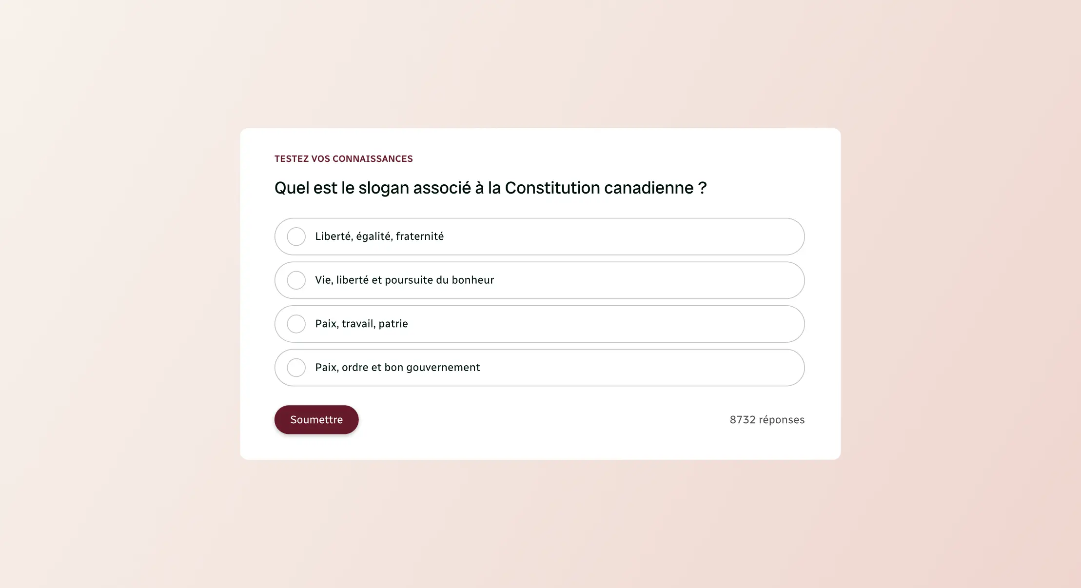
A Common Language
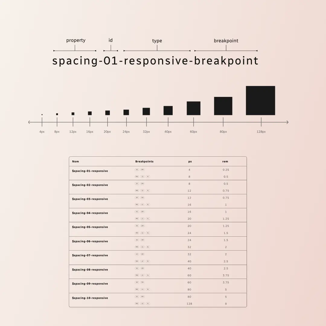
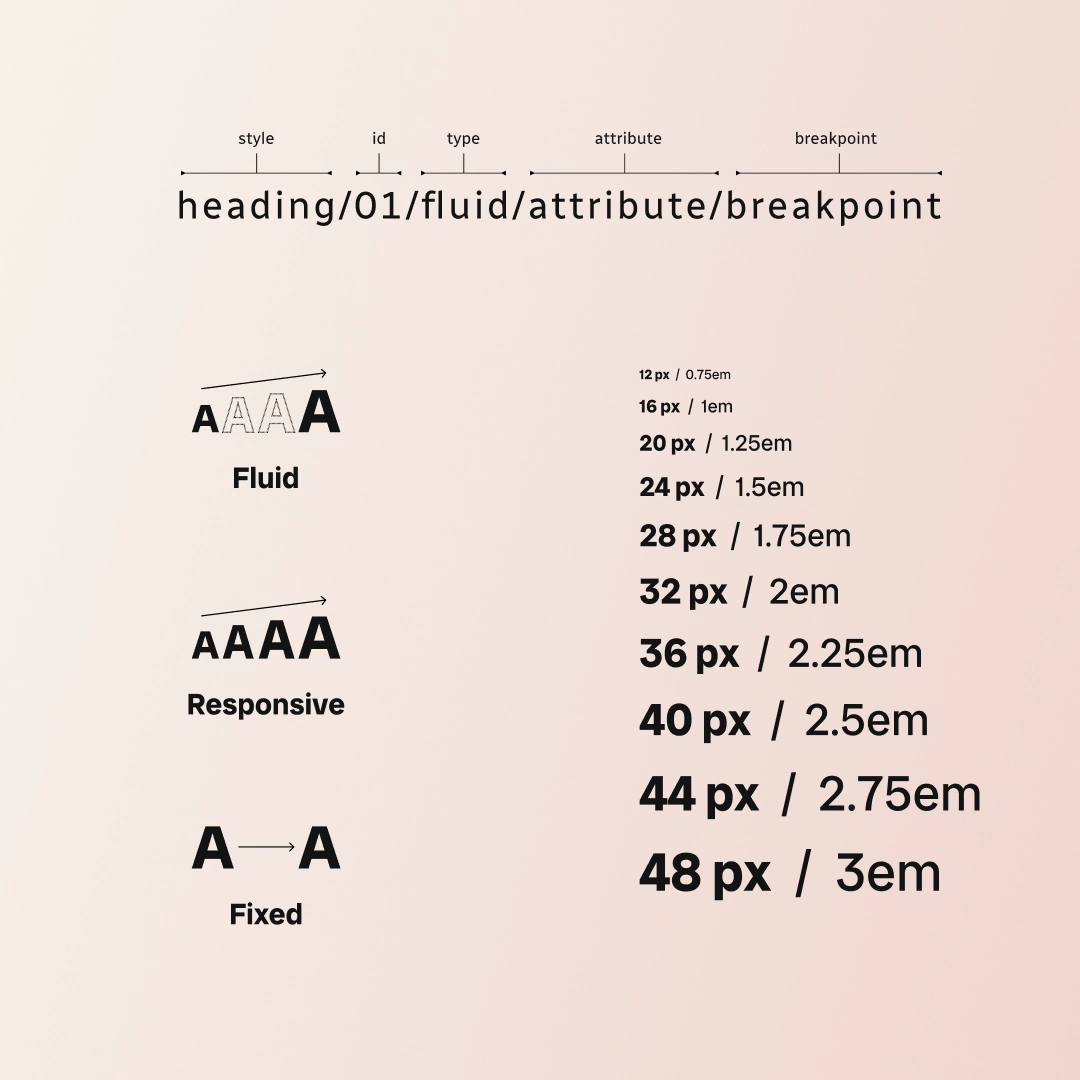
The nomenclature of variables and components played a central role in the Design System. Designed to be understood by both designers and developers, it established a common language across the entire product. Spacing, typography, colors, and components followed consistent naming conventions to facilitate collaboration, ensure system maintainability, and promote uniform implementation at scale.
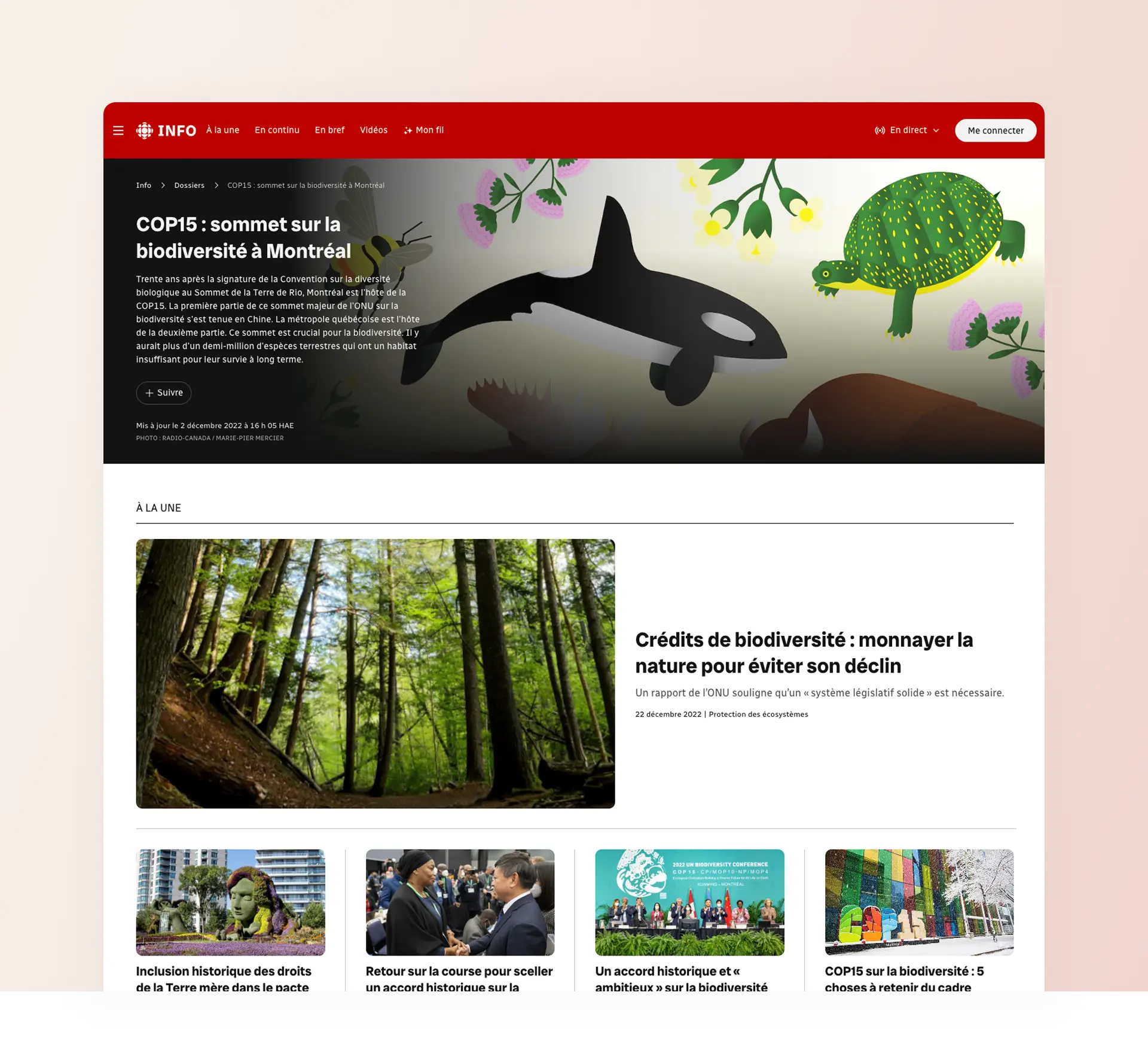
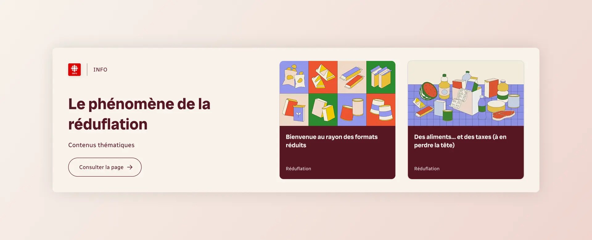
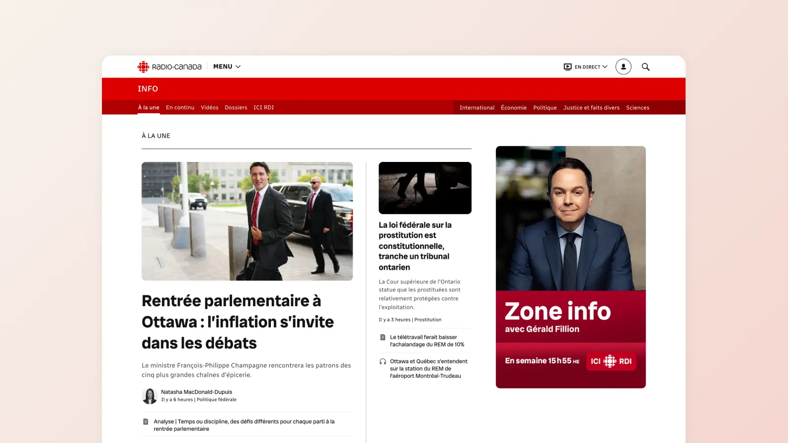
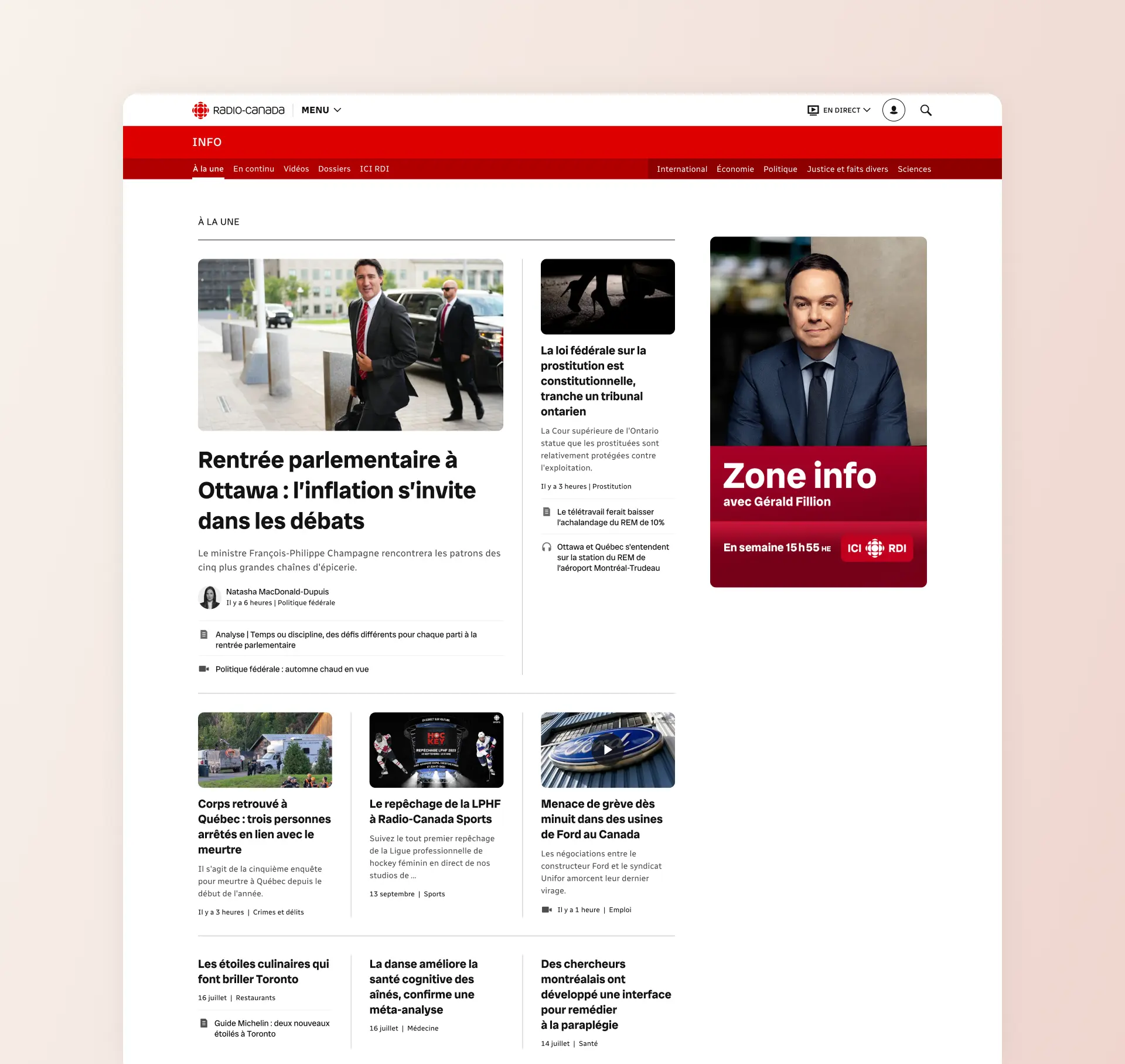
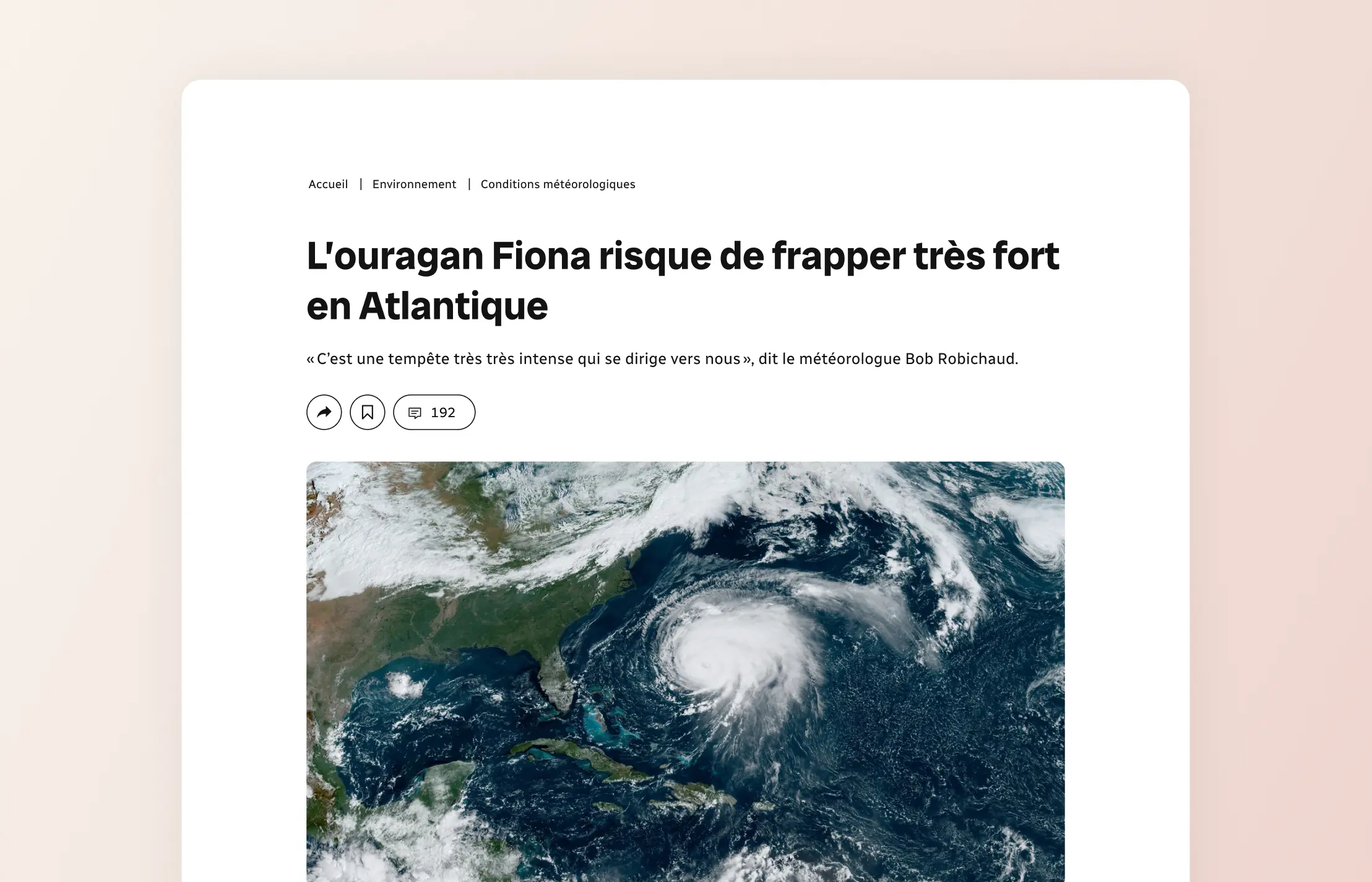
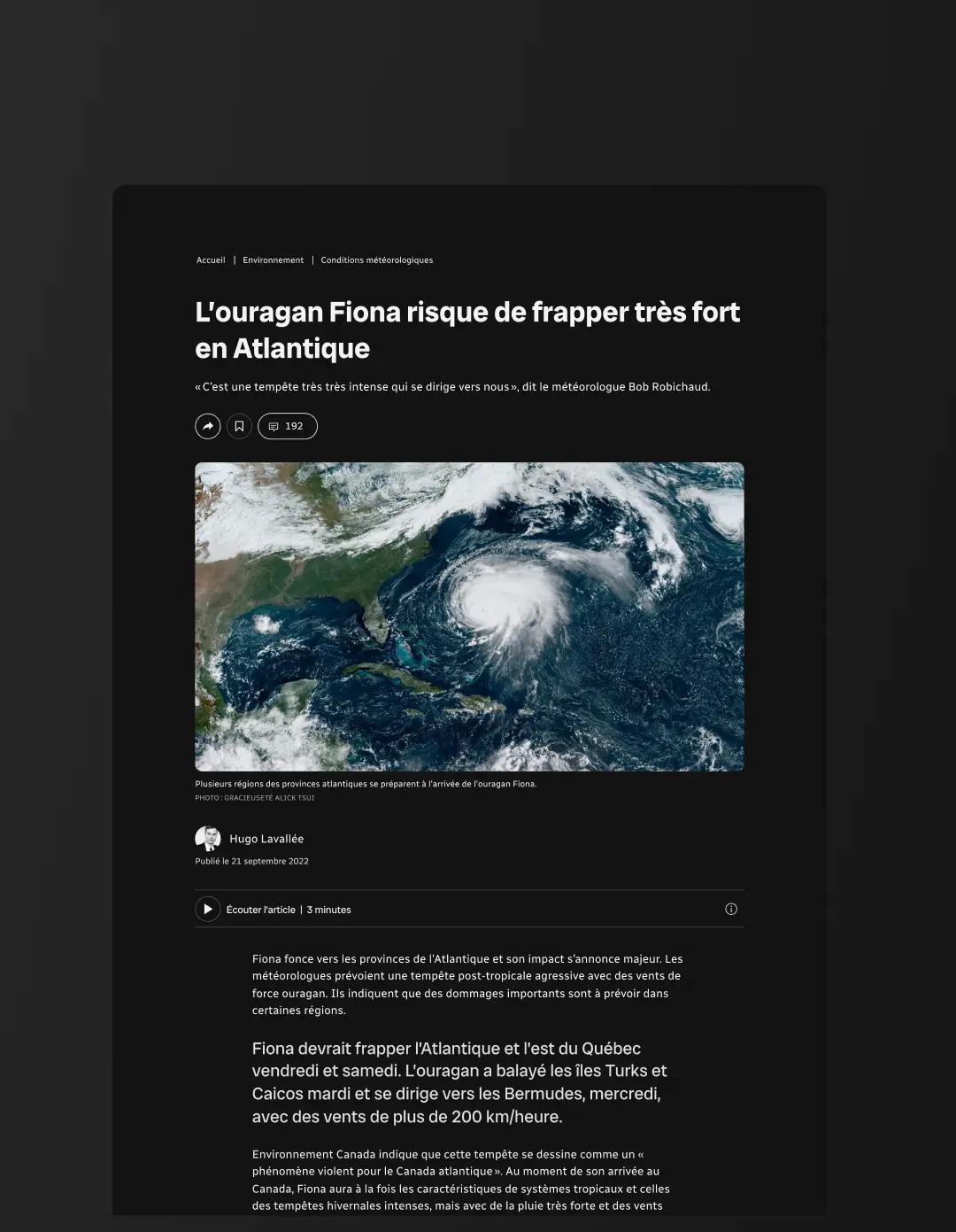
Redesign of the Article Template
The article template of Radio-Canada was completely redesigned within the framework of the Design System. It structures and orchestrates several reusable components to unify the reading experience and strengthen the coherence of the product.
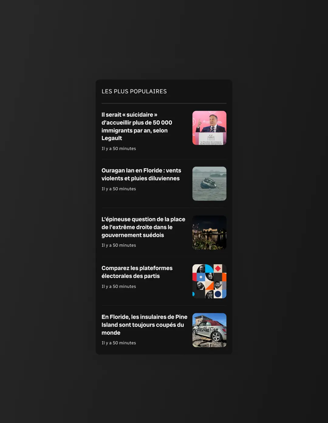
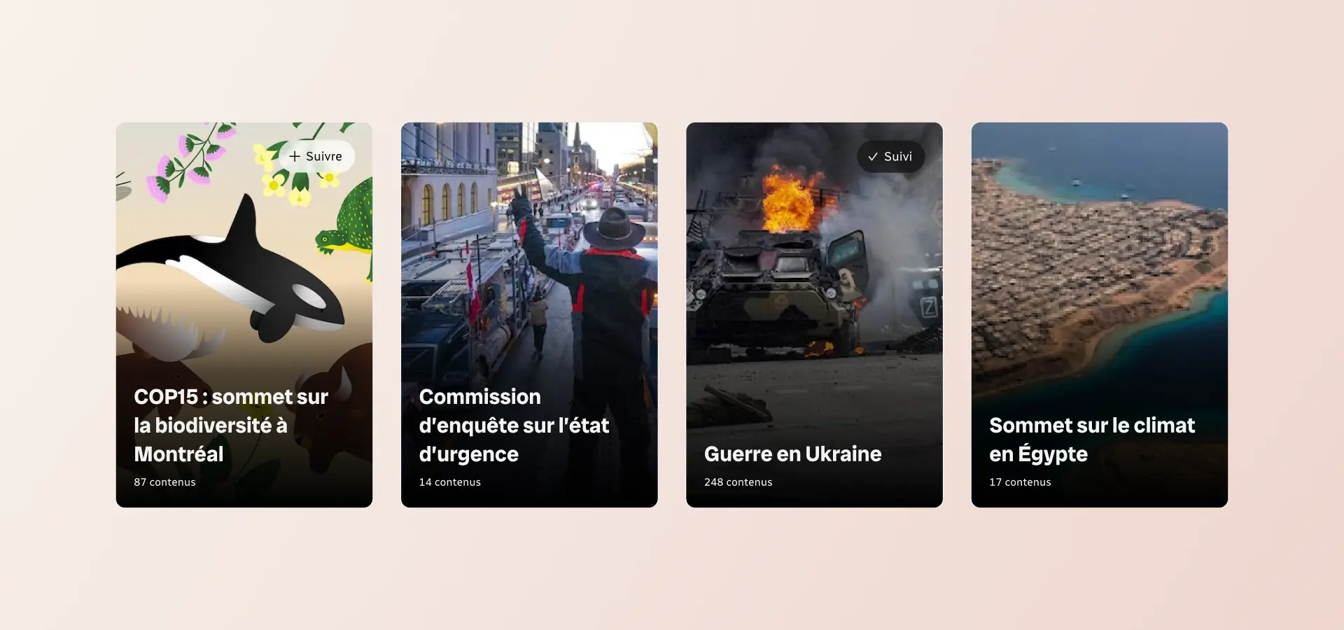
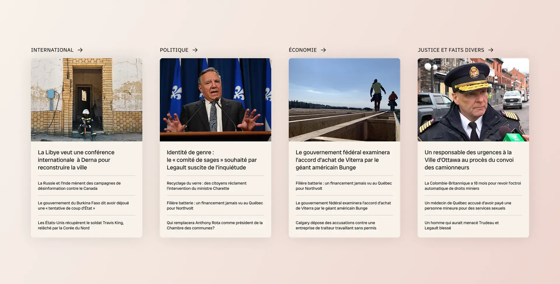
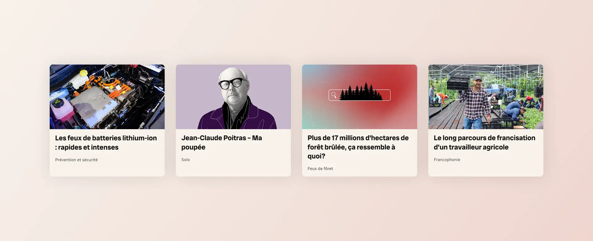
A Modular System
The components were designed as a modular system, capable of adapting to different uses and formats. Whether it was cards, folders, or journalistic content, each element could be reused and combined in multiple contexts while maintaining overall coherence.